Fragmented mobile experiences across two legacy apps led to inconsistent UX, uneven maintenance, and limited cross-engagement between traditional listings and auctions.
Delivered a unified native iOS and Android app aligned to current branding, reducing product fragmentation and establishing a scalable foundation for future growth.
Xome
Real Estate Technology
Senior UX Designer (Sole Designer, Lead)
5 months
Legacy Product Redesign & Feature Enhancements
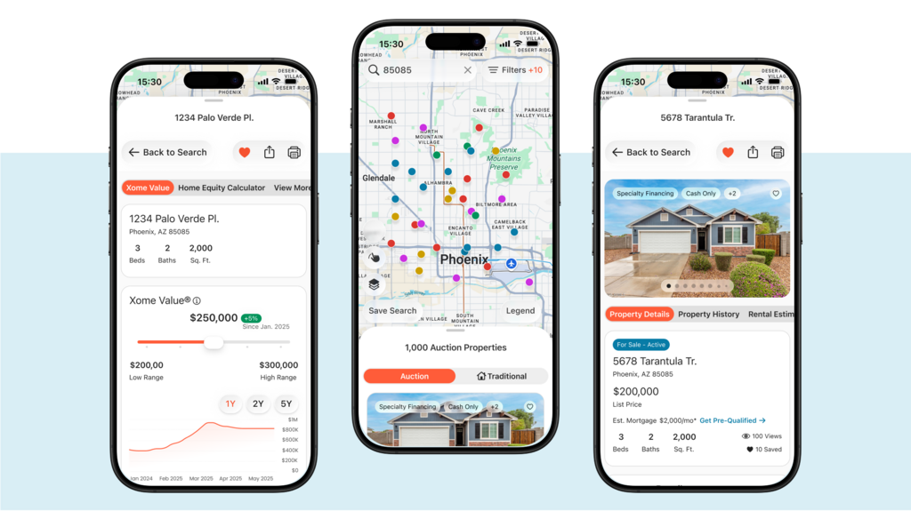
The existing mobile apps were originally developer-led utilities that have evolved over several years without a cohesive UX strategy. Two separate native apps supported different business models: Traditional Listings and Auctions. Users who wanted to engage with both had to download and manage multiple apps or default to mobile web.
This fragmentation created several compounding problems:
The business goal was not simply to refresh the UI, but to consolidate both experiences into a single, unified native app that could support future growth without repeating past neglect.
This project operated under several constraints:
These constraints required careful prioritization, clear decision-making, and consistent communication to prevent scope creep or misalignment.
As design lead, I was responsible for not only the UX direction, but also for planning and execution across the entire lifecycle.
Key decisions included:
A particularly important decision was pushing user testing to post-launch. Stakeholders requested mid-cycle testing to compensate for missed discovery in the mobile web project. I advocated strongly against rushed, low-quality testing, documenting how existing observational data and domain expertise were sufficient to deliver a strong MVP. This approach preserved focus and allowed for more meaningful testing once a functional product exists.
This was a difficult but ultimately successful negotiation that protected both timeline and design integrity.
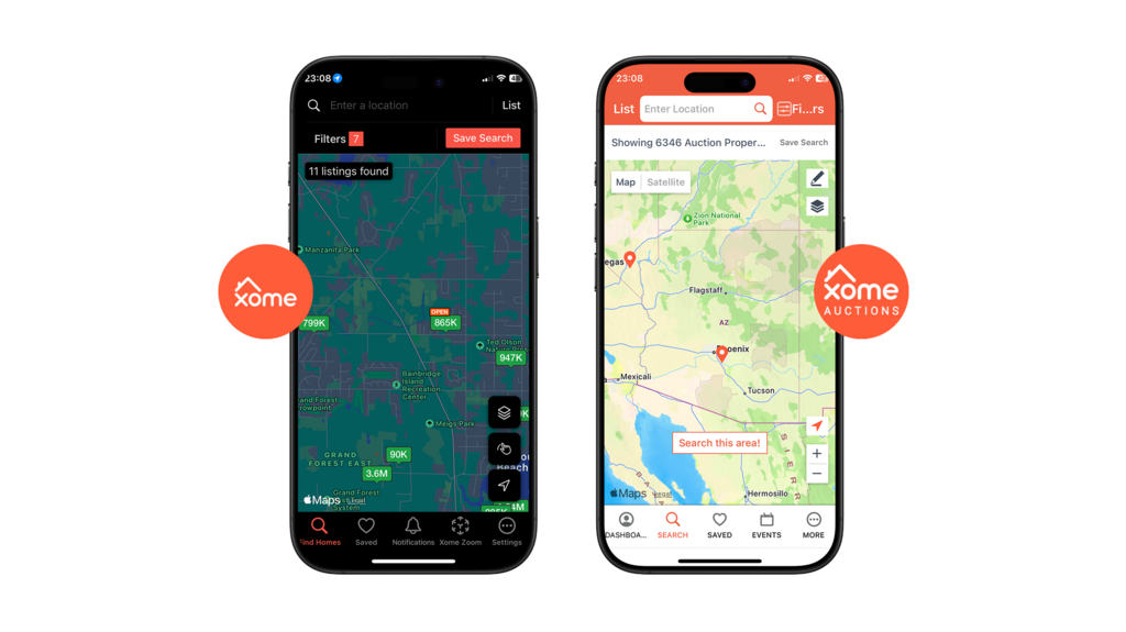
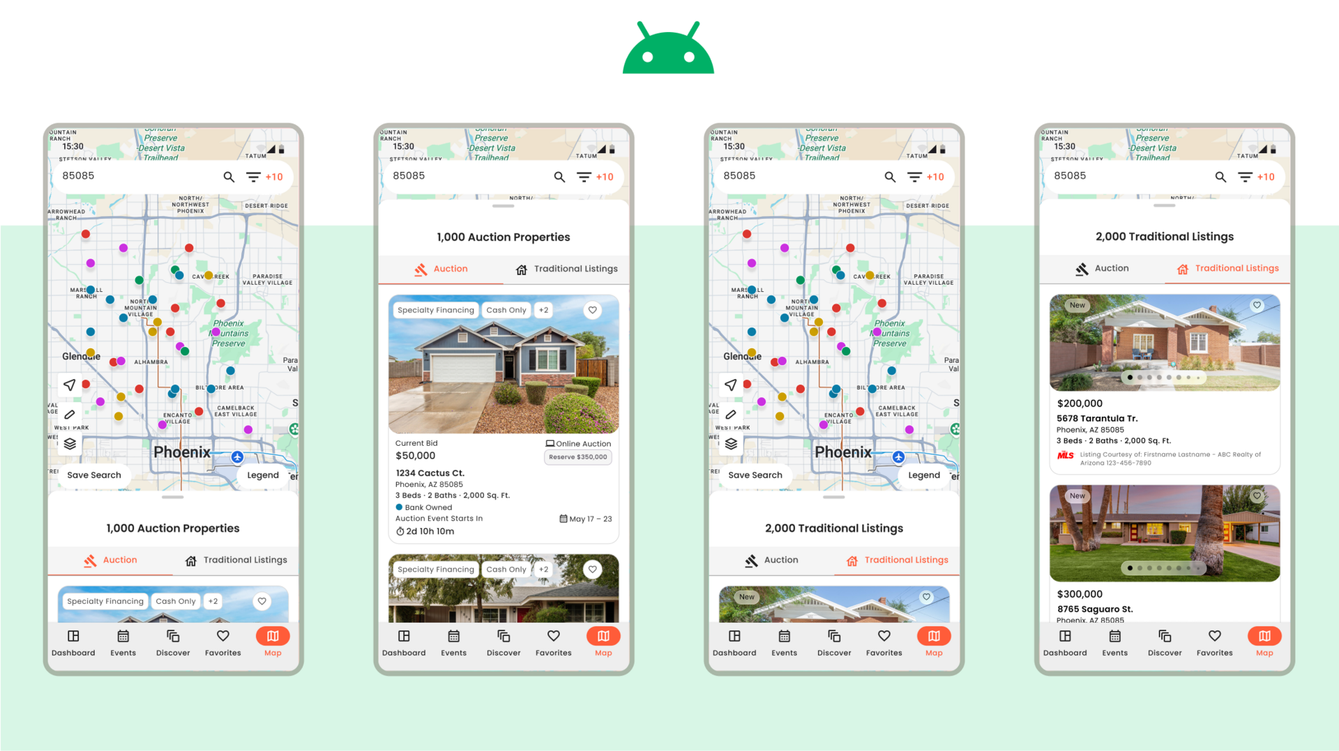
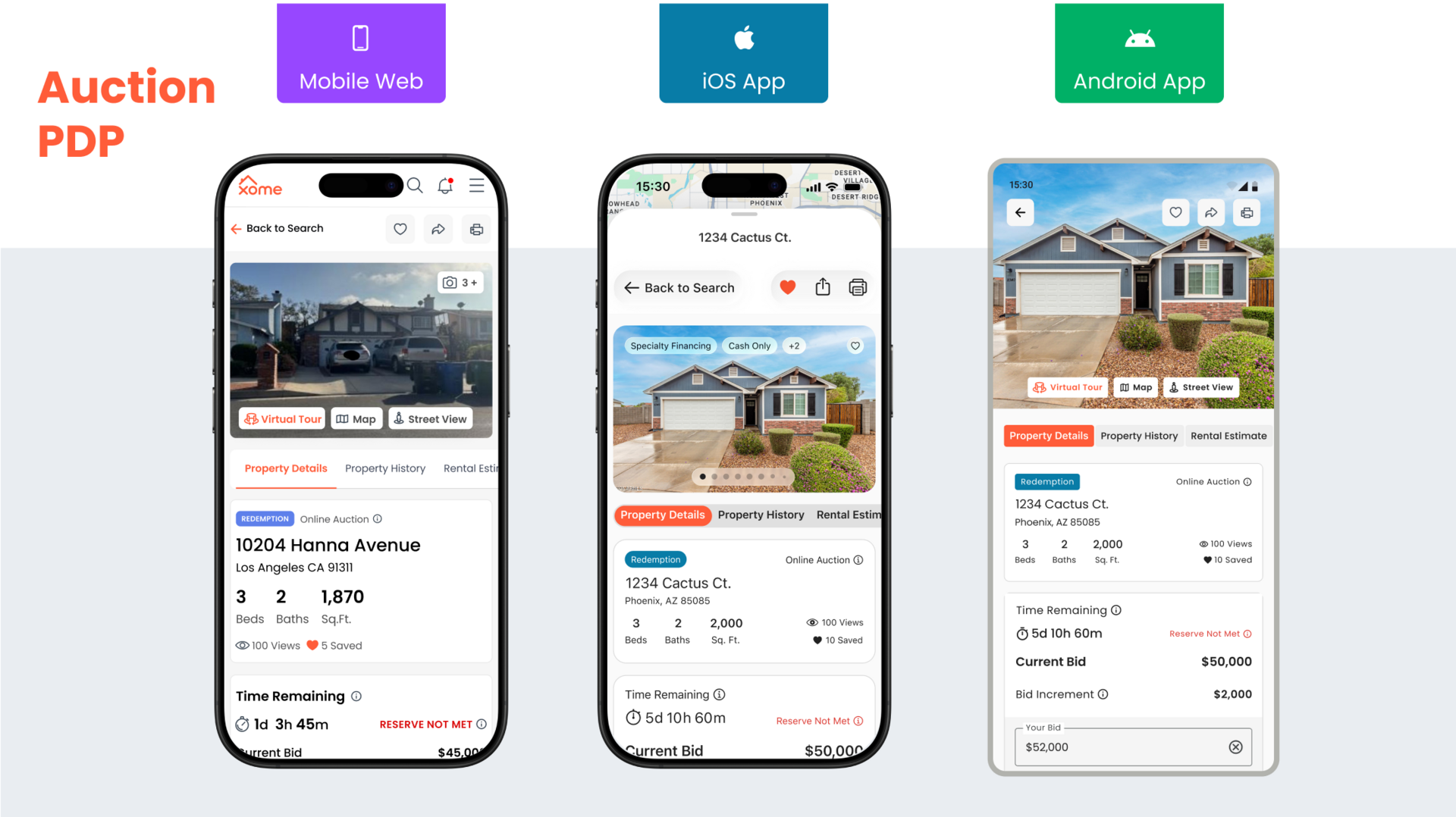
Rather than forcing strict parity, I leaned into native iOS and Android design systems, allowing each platform to feel familiar and device-specific while maintaining brand coherence.
This approach:
Shared branding elements were carried consistently across both platforms so the experience felt unified, even as interaction respected platform norms.
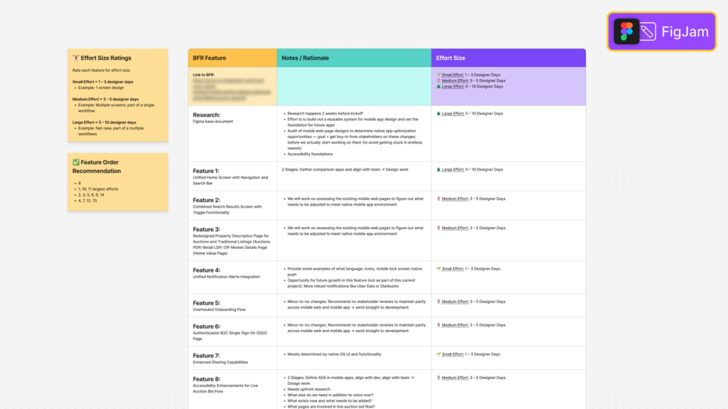
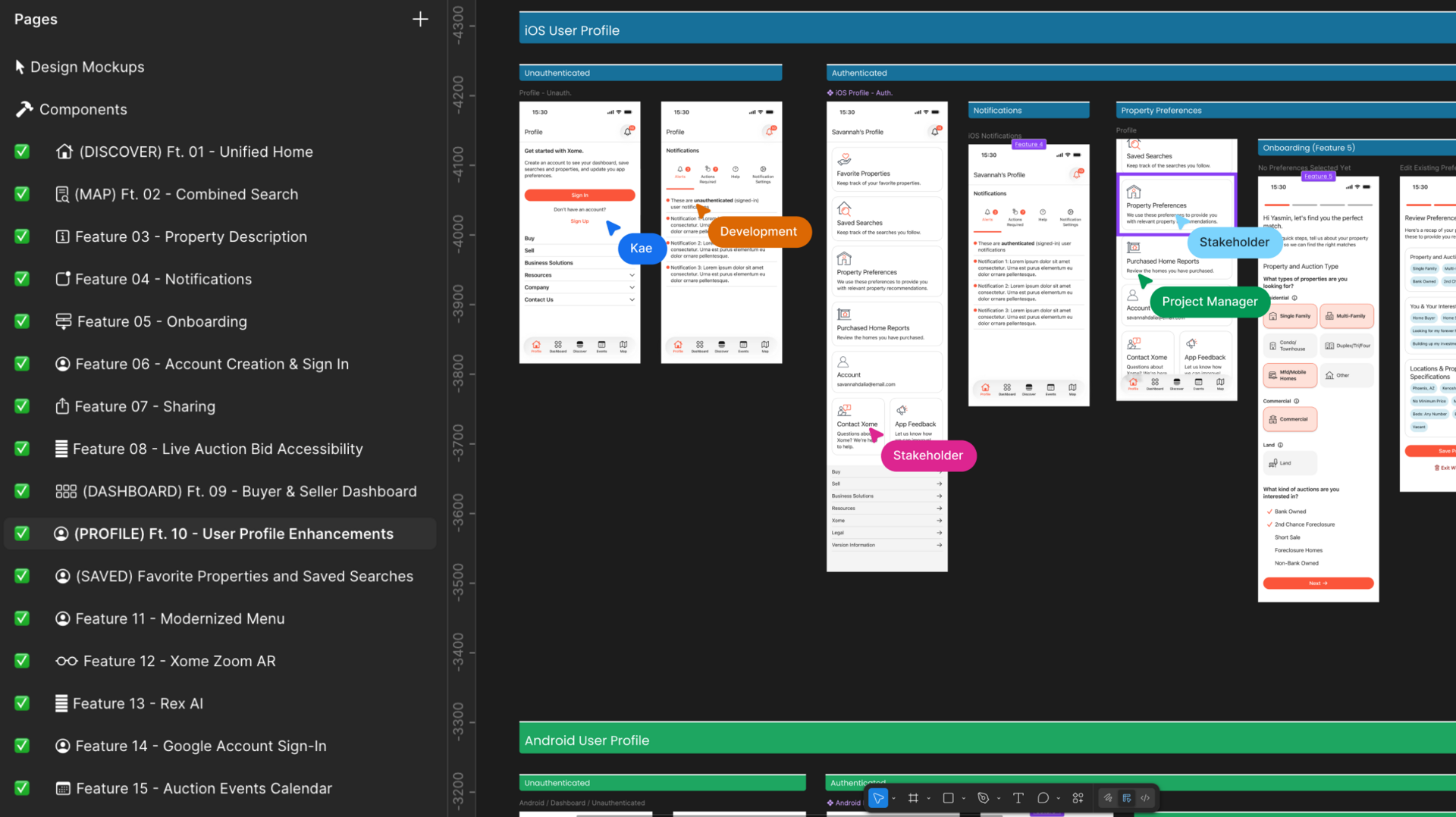
The design process was structured around focused feature sets.
For each feature set cycle, design concepts were built, core product teams reviewed together, technical teams reviewed together, and then stakeholders reviewed and approved together with representatives from design and technology present to facilitate rational questions.
Early in the project, I shifted from live review meetings to recorded walkthroughs explaining design decisions in detail. This change proved especially effective for our internationally distributed team, reducing interruptions, preventing derailment, and significantly improving feedback quality. Stakeholders responded positively, and trust increased as rationale and intent were clearly documented.
As design concludes and development begins, quantitative metrics are not yet available. However, several meaningful outcomes have already emerged:
With more time, I would explore:
This project reinforced my ability to plan, lead, and deliver a high-visibility enterprise product end-to-end, while navigating stakeholder pressure, managing contractors, and defending decisions that protected long-term UX quality. It also validated that clear communication and principled decision-making are as critical to success as the design itself.