Xome
Real Estate Technology
Senior UX Designer (Sole Designer, Lead)
Our starting point for this project consisted of two existing apps, one for traditional property listings and one for auction properties.
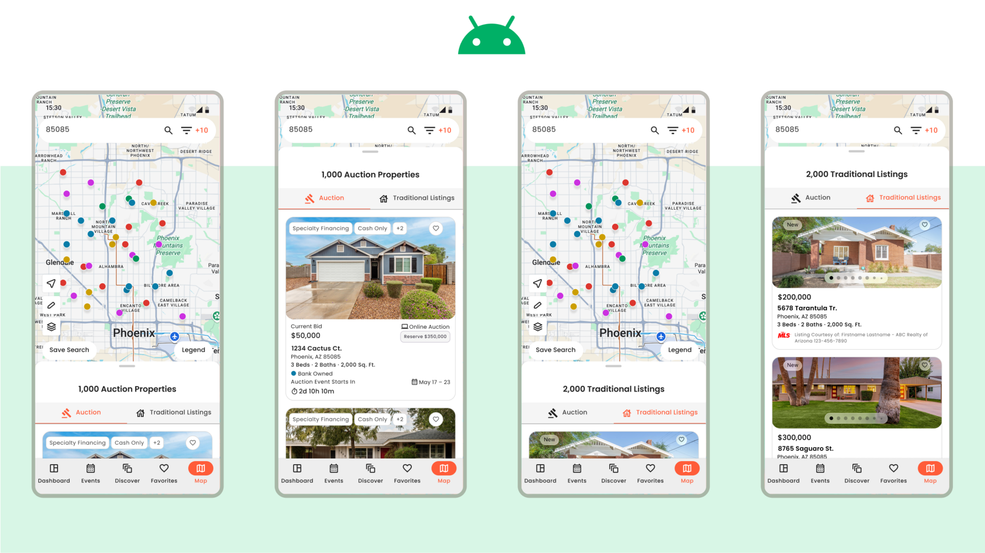
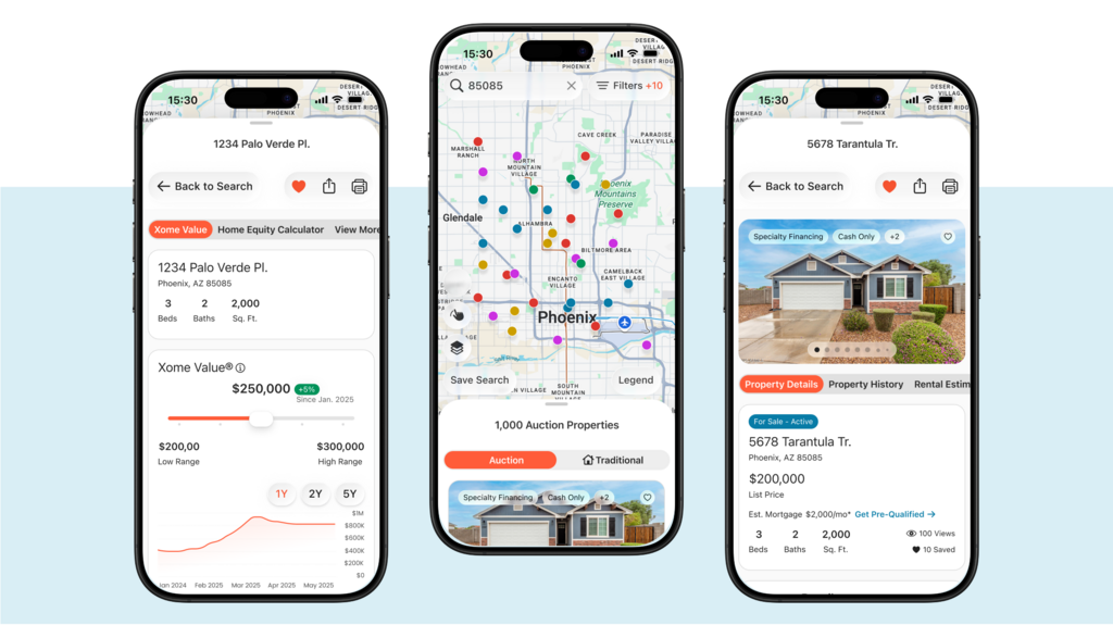
Our primary goal for the project was to create a single app that allowed users to move seamlessly across both traditional and auction experiences.
Our secondary goal was to tailor the app to iOS and Android native experiences, updating UX where it made sense along the way.
Below is the starting point for this project, with Xome traditional app on the left and Xome auctions app on the right.
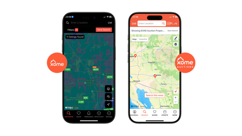
Pre-Redesign: Xome traditional app (left) and Xome auctions app (right)
In tandem with my Product and Project Managers, I led design strategy to build a strong production plan. I organized each major feature into priority order, with guidance from Engineering, and assigned effort scores to communicate an estimation of level of design effort.
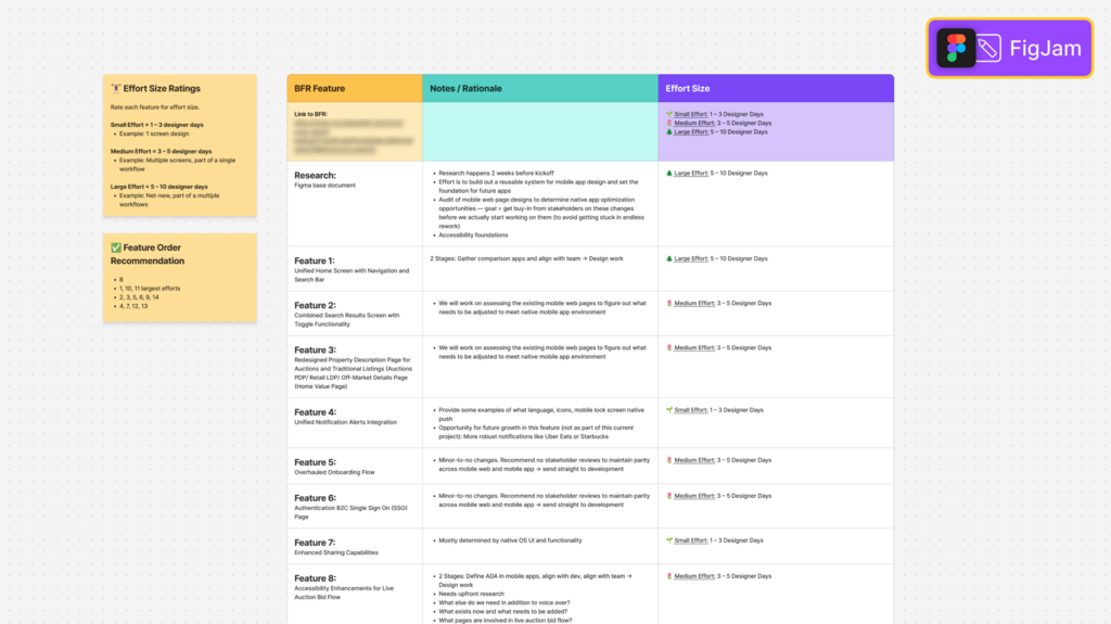
FigJam file of design estimation plan
To achieve strong, platform-native experiences, I looked to Google's Material 3 and Apple's Human Interface Guidelines to help drive and accelerate UI production work.
This decision allowed out UI to look and feel like Xome through our branding, yet feel right at home on an iOS or Android phone with subtle characteristics and deep accessibility features.
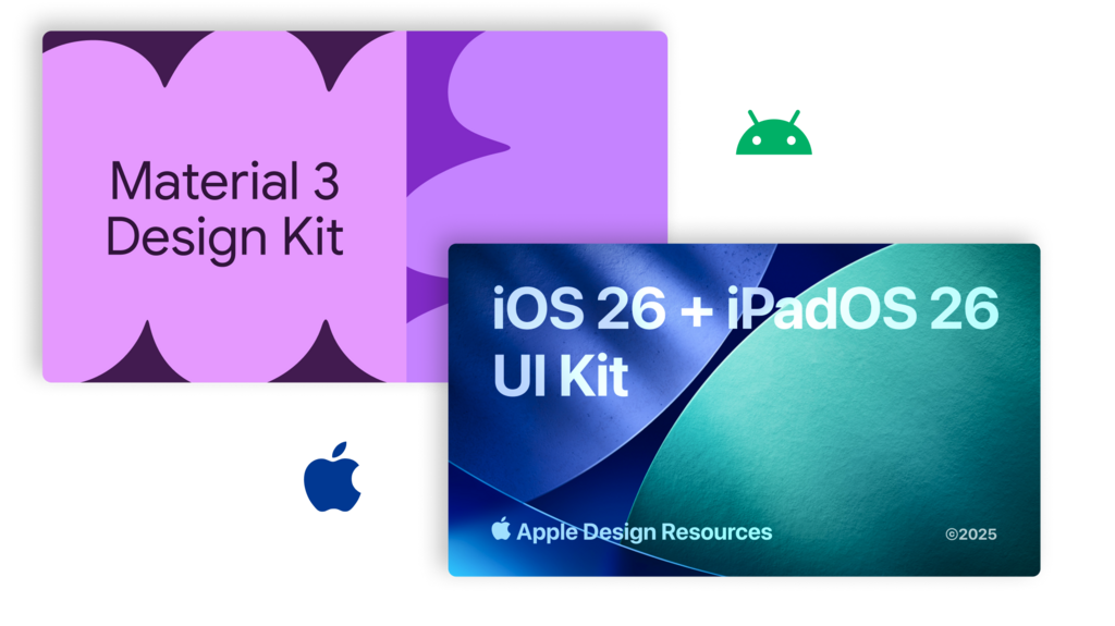
Figma file covers for Google Material 3 and Apple UI kits
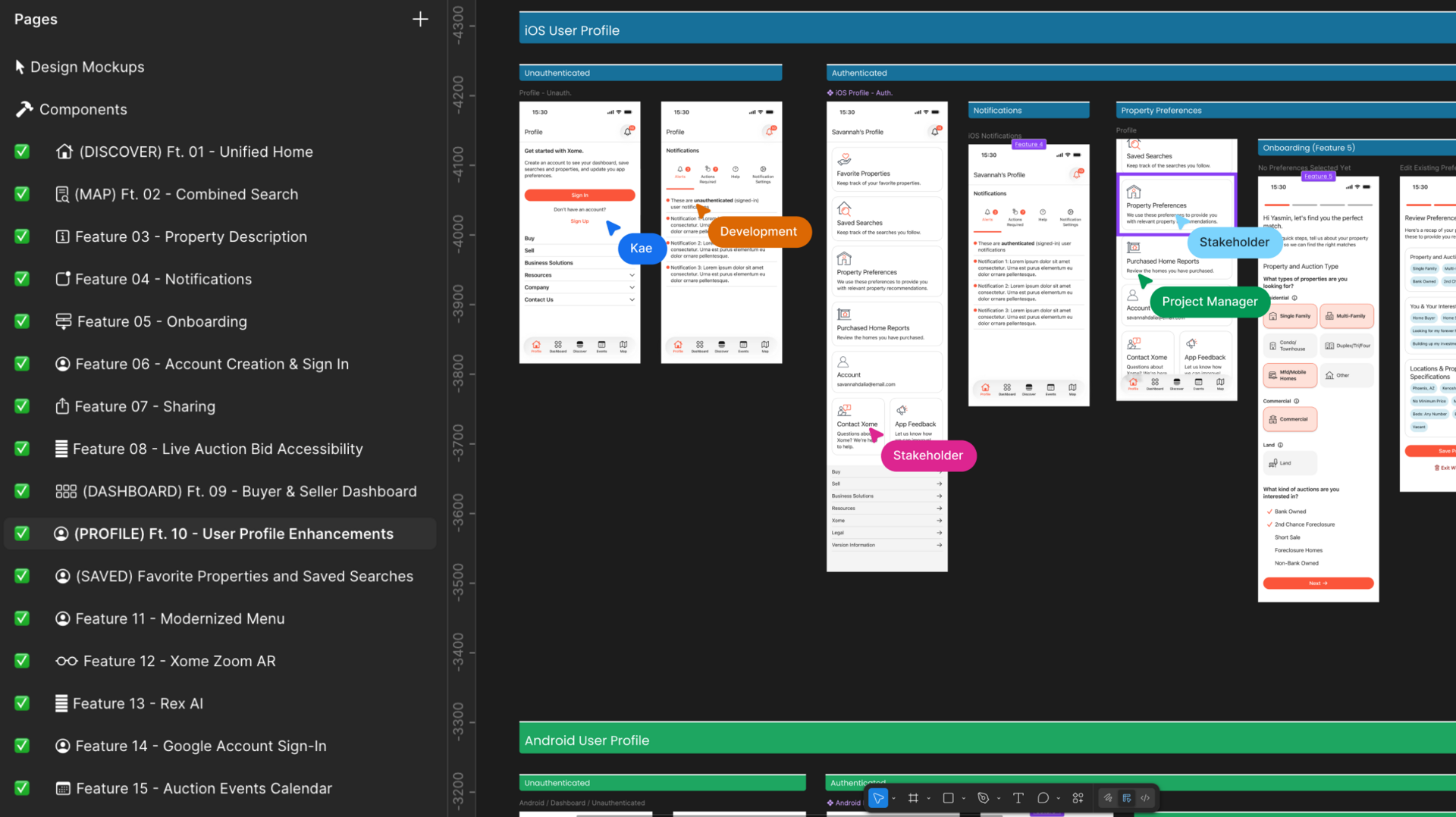
I am a big Figma fan and I try to get as many technical collaborators into my files as possible because I truly believe collaborative work yields stronger results than things we try to design in isolation. Plus it's just fun to vibe with my colleagues!
This project was no different and I invited Project Managers, Developers, and Stakeholders into the mix as the project progressed. Each expert provided their points of view, brought up constraints, and helped shape what we wanted to achieve with this new era of our app.
Below is a screenshot from my Figma file, where I invited colleagues into the design space to collaborate together.
This is the end of my journey on this project, as my work was intended to be conceptual and to help facilitate critical and actionable stakeholder discussions.
It was interesting to explore blending two different sides of the business into one space while balancing strict legal and compliance constraints along the way. And as always it is such a pleasure to tailor experiences with my users in mind.
I am excited to see where this app goes with the next team and I am so glad I got to contribute foundational work on such a fun and complex app.