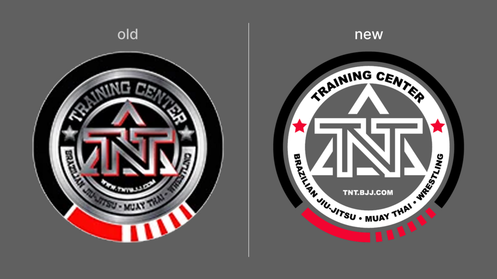
The existing logo struggled with scalability and print clarity due to complex textures, gradients, and inconsistent geometry.
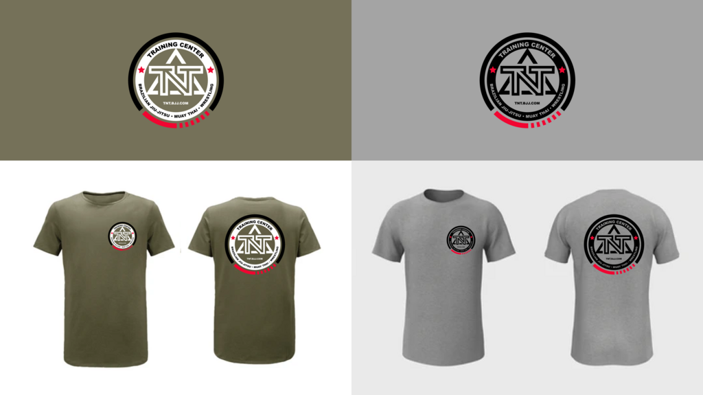
A set of refined vector-based logo variants that preserve brand recognition while improving scalability, geometry, and long-term print flexibility.
TNT MMA Training Center
Fitness
Senior Graphic Designer (Sole Designer)
1 week
Brand Evolution
The original TNT MMA logo carried strong brand recognition and sentimental value within the gym community. However, it was not optimized for technical performance.
Use of display fonts, gradients, and texture effects limited its effectiveness at extreme sizes in both small-scale applications (such as embroidery or compact apparel prints) and large-scale formats (such as signage or wall graphics). Additionally, the geometry lacked refinement, which affected visual polish and premium perception.
This project required careful balance and restraint.
Several deliberate decisions guided the refresh:
The guiding principle was evolution through precision, not reinvention.
The strategy centered on technical optimization and aesthetic refinement while preserving identity continuity.
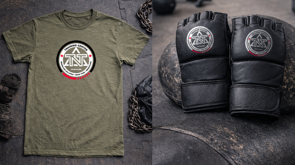
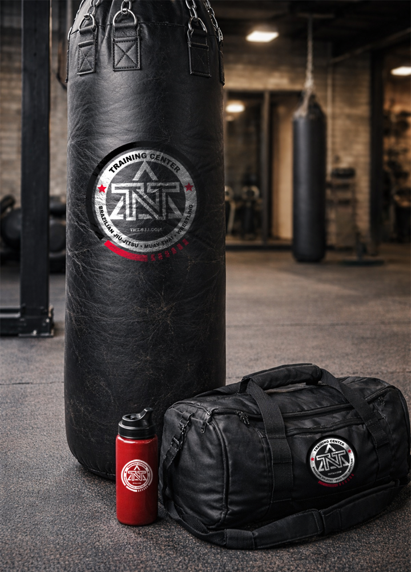
The overall effect is subtle but meaningful. The new logo is more premium, modern, and technically sound without abandoning its roots.
Although self-initiated, the project was grounded in real-world brand sensitivity.
Discussions with gym staff helped develop understanding of the original logo's history and pinpoint subtle, yet critical characteristic details. Design analysis of the existing logo elements yielded insight into which pieces carried the strongest brand recognition and what elements would benefit from updates. Special attention was focused on the belt element encircling the logo, a key symbol in the community culture and a signifier of the highest ranked practitioners of this martial art.
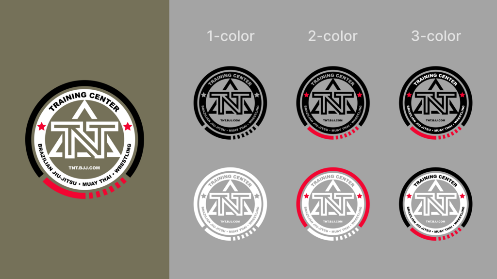
Across most of the logo variations the belt is represented as a black belt with 6 red stripes, as it exists in reality at the highest Brazilian jiu jitsu rank. The exceptions are the 1-color variants where the meaning of the belt is neutralized by reducing to monochrome, and the 2-color red and white variant where the meaning of the belt is neutralized by using red, a non-real belt color.
Feedback from those familiar with the brand confirmed that the refresh captured the essence of the original logo while elevating its quality.
While not yet fully implemented, early reactions to the refreshed logo have been strongly positive. Viewers consistently note that the mark feels cleaner, more modern, and more refined while still clearly representing the gym.
The updated logo now supports:
This project demonstrates how thoughtful refinement can strengthen a brand’s technical performance without disrupting its identity.
This project reinforced the importance of restraint and creative collaboration in brand work. Not every identity requires reinvention and this experience is a good reminder that, as a broader design principle, meaningful improvement comes from precision and clarity, not dramatic change.
This logo demonstrates a level of detail and decorum that is characteristic throughout my entire body work and an enduring pillar to my practice as a designer. The belt element in particular may largely go unnoticed to the untrained eye, but the details carry significant meaning to the distinguished practitioners in this martial art who will recognize the respectful treatment and care. This level of humanistic consideration is very important to me.