Logo update to occur slowly over time through business areas
Design Approach & Rationale
With the existing logo serving as a strong foundation, the approach was to modernize instead of redesign.
This approach allowed for:
slow integration of the new logo over time so as not to create too glaring of a contrast between applications of the old and new logo in shared spaces
continuity of gym-goers' recognition of the old logo with enough difference to be noticibly refreshing
Outcome & Impact
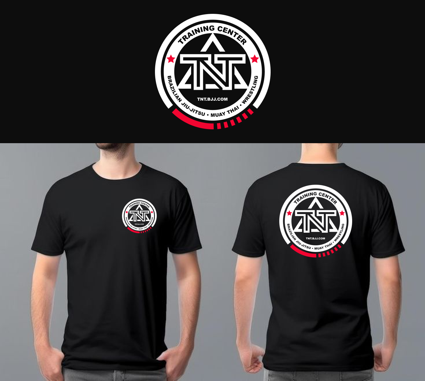
The overall geometry of the logo was cleaned up to bring a sense of modernity.
Gradients were swapped for solid colors and a more legible font was selected to aid in reducing print complexities and improve the logo's range of scalability.
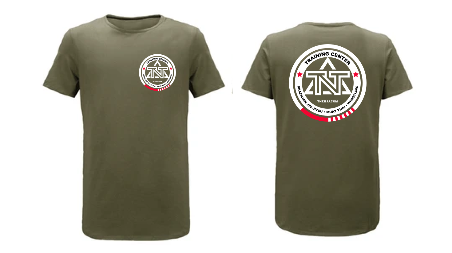
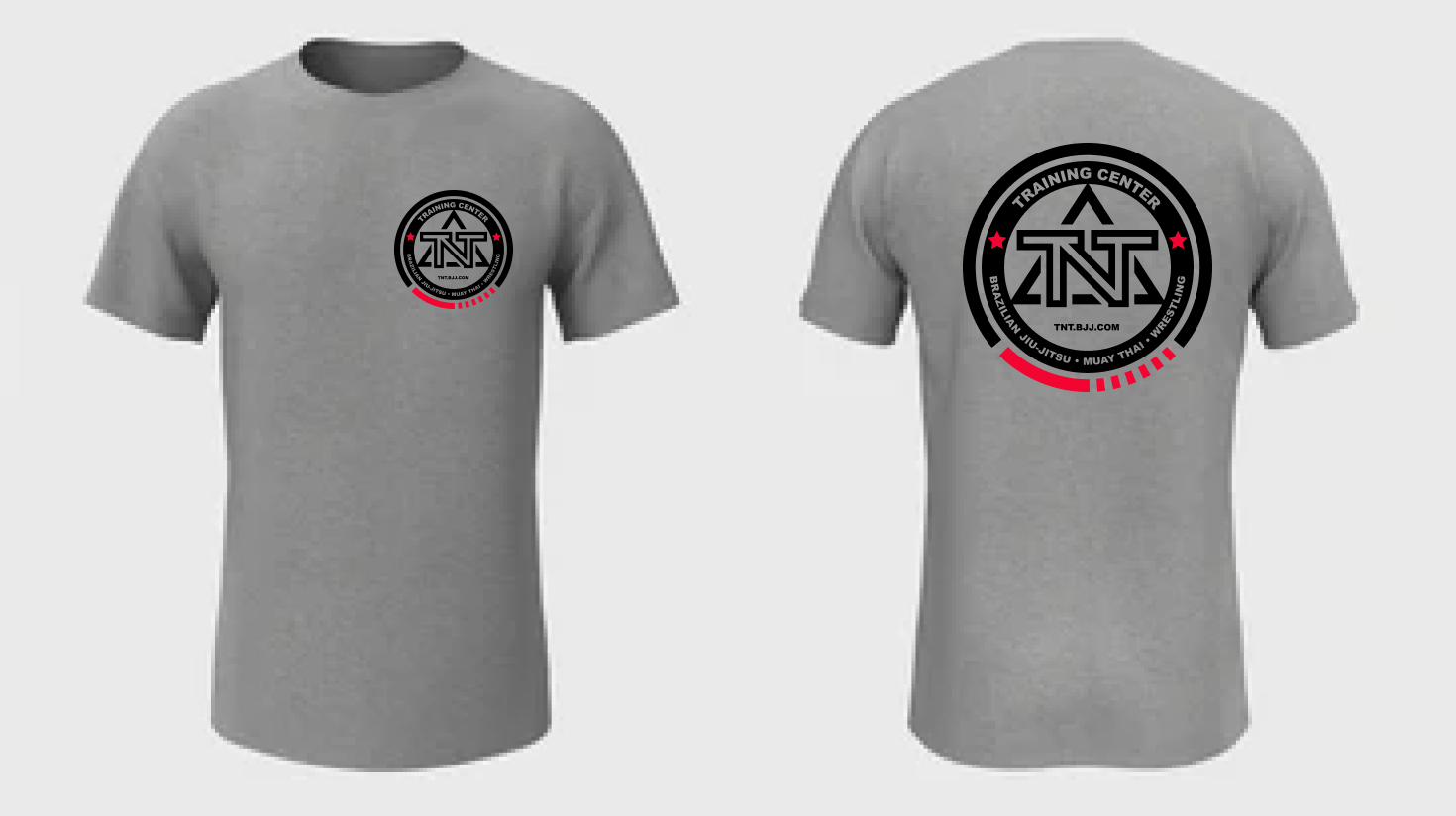
The final logo structure was then versioned into several color combinations to allow for flexibility in application across a variety of environmental and merchandising surfaces.