Transform a tedious monthly reporting workflow into a desktop self-serve enterprise dashboard so institutional clients can monitor assets and complete tasks without relying on client-manager calls.
Launched a 6-month MVP to pilot clients, then evolved the experience over the following year into a flagship B2B product praised for its usability, clean interface, and real-time visibility. The product successfully shifted clients from passive monthly reviews into an on-demand self-service workflow, while supporting Xome’s technology-first goals.
Xome
Real Estate Technology
Senior UX Designer (Sole Designer, Lead)
0→1 Enterprise Product / B2B Dashboard
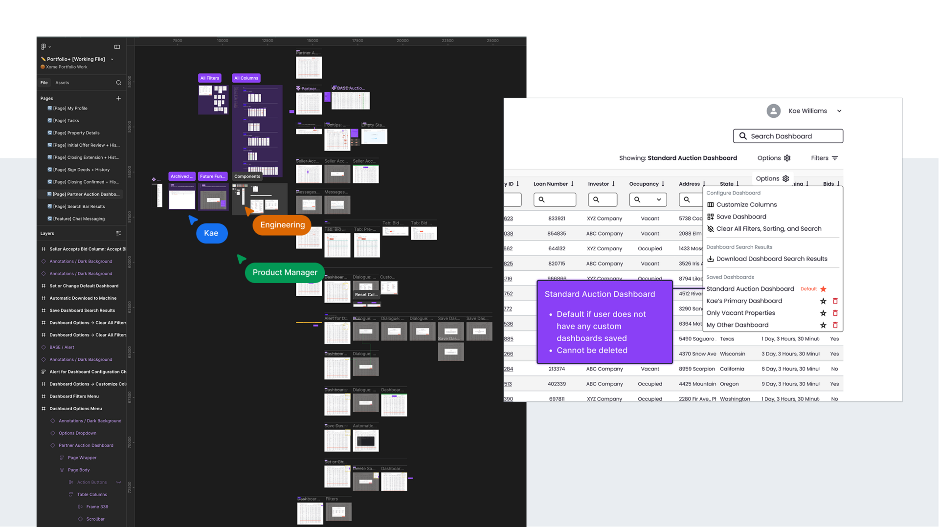
Institutional sellers had access to highly valuable auction portfolio data, but the experience of accessing it was entirely service-mediated. Before Portfolio+, clients relied on monthly calls with client managers, who would share their screen and walk them through backend portfolio information. While this workflow technically surfaced the right data, it created a major operational bottleneck where clients lacked real-time visibility into their active auction properties and had limited ability to independently prioritize tasks.
For clients, the workflow reduced autonomy. Time-sensitive portfolio actions were constrained by a reporting cadence that did not match the speed of active auction movement. Users often arrived with a specific sequence of tasks to complete, yet the existing process forced them into passive observation rather than direct action.
For Xome, the model was difficult to scale. Client managers were the interface between internal systems and enterprise customers, which consumed valuable servicing time and limited Xome’s ability to position itself as a modern real estate technology platform.
Portfolio+ was shaped by a set of technical, workflow, and organizational realities that heavily influenced the product strategy.
A major technical constraint was that portions of the information architecture were already defined by backend data structures, limiting how far workflows could diverge from existing system logic. Early designs were also centered around platform-specific UI elements, limiting the creation of novel solutions to user problems.
The hardest reality was orchestrating all user paths throughout the product so they felt intuitive despite the underlying complexity. I often approached this work like a trail guide breaking new ground through a dense forest of data designing clear routes, reducing dead ends, and helping users maintain momentum as they moved from high-level portfolio awareness into more focused actions.
As the product vision expanded, the constraints of the platform-specific UI became increasingly visible. The business decided it was worthwhile to pivot from platform-built to a custom, in-house build. This allowed for more design freedom, the opportunity to better meet user needs in context with tailored features, and set the foundation for a much stronger MVP with more potential to scale in future iterations.
Organizationally, this work benefited from a delightfully effective project management / design partnership with minimal stakeholder overhead. High-trust collaboration between product management, UX, and engineering allowed the team to move quickly, maintain strong design fidelity, and evolve the experience rapidly based on direct client feedback after launch.
My core UX strategy for Portfolio+ was client adoption and my approach was to design around task momentum rather than passive data visibility.
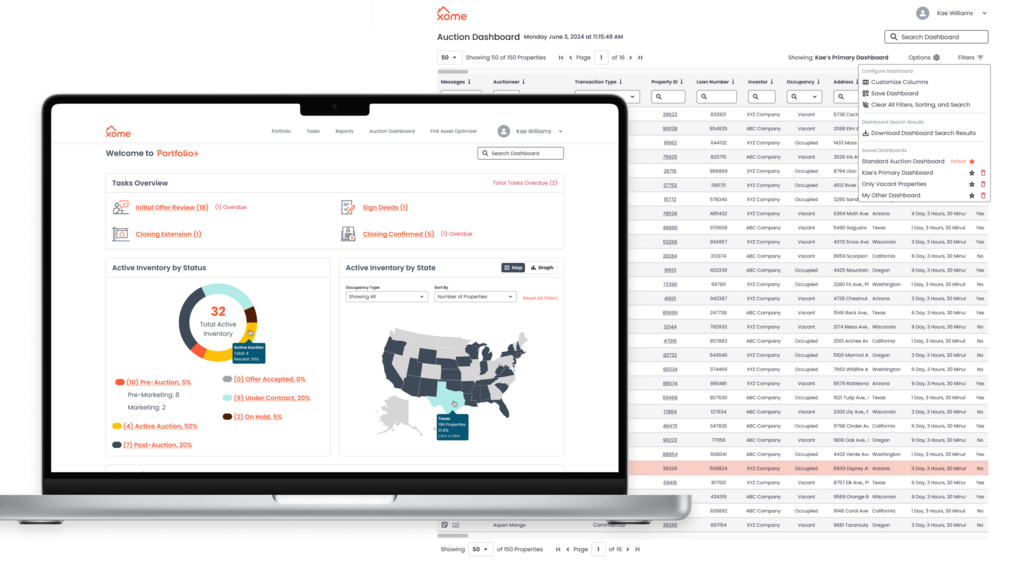
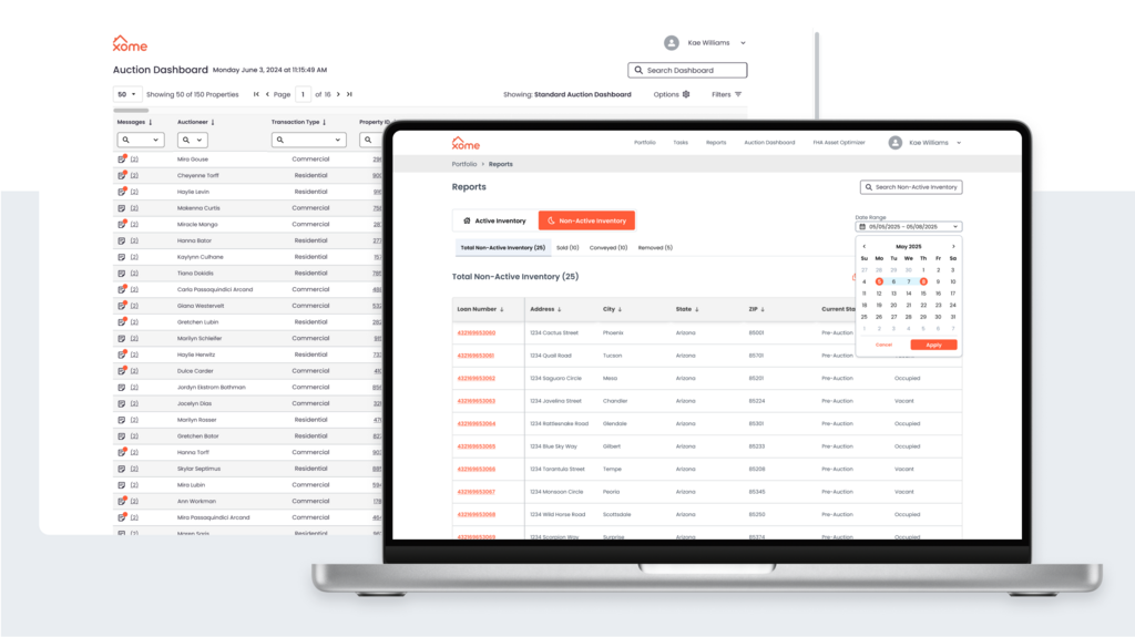
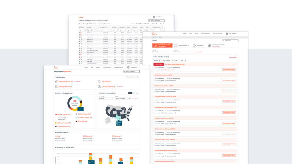
Although the product surfaced large volumes of live auction portfolio data, users rarely entered the experience to explore information broadly. Institutional sellers typically arrived with a known sequence of actions to complete, making it critical that the interface reduced time-to-task, preserved flow continuity, and clearly guided movement between overview dashboards, prioritized tasks, and live property tables.
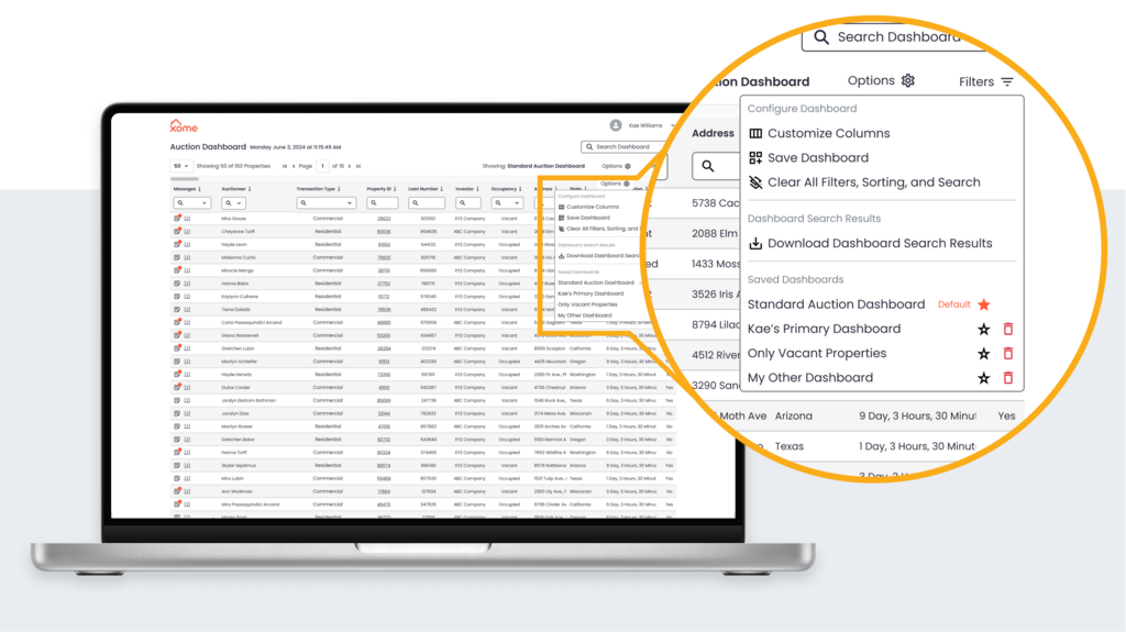
I approached the interface with the goal of using a traditional dashboard as the landing page of the application, and then quickly shuttling users into their most critical tasks. My strategy focused on creating meaningful pathways through dense information, ensuring that each layer of the interface progressively revealed the next most relevant action without overwhelming users with portfolio complexity.
My second strategic priority was supporting the transition from a service-led model to self-service adoption. Because client managers still needed to use the interface during screen-share calls, the experience had to feel intuitive in both guided and independent modes of use. I took a lot of care to preserve familiarity so motivated clients could jump into self-serve right away and client managers could support clients needed more support and time to make the transition.
The success of Portfolio+ was deeply tied to product management, UX, and engineering operating in harmonious collaboration.
From the earliest phases of MVP definition through post-launch feature expansion, I worked in close partnership with the project manager, reviewing designs together multiple times each week to ensure the evolving experience continuously aligned with business priorities, technical realities, and user adoption goals.
This high-frequency collaboration model allowed design and product strategy to evolve in parallel. As I introduced expanded UX recommendations, we were able to quickly pressure-test ideas together, refine the flows, and make confident decisions without losing momentum.
A particularly effective part of the process was the translation layer between design and engineering. Once we aligned on workflows and interaction patterns, the PM converted design concepts into highly detailed engineering stories, creating exceptional clarity for development. This yielded near-perfect design-to-development fidelity, allowing the product to launch with the intended usability patterns intact.
The collaboration model was intentionally lightweight. Minimal stakeholder overhead and strong trust across PM, UX, and engineering created a technician-led environment where the team could move quickly, solve real workflow problems, and iterate rapidly based on direct client feedback after launch.
After releasing the MVP to pilot clients, the process shifted into a feedback-driven evolution loop. Positive client response, combined with voiced needs from early adopters, directly informed the next year of feature expansion and workflow refinements, allowing the product to mature in response to real enterprise usage rather than internal assumptions.
Portfolio+ exceeded its original scope expectations and quickly proved its value through strong early client adoption and overwhelmingly positive feedback.
The 6-month MVP launched to a pilot group of institutional clients, who immediately responded positively to the product’s clarity, usability, and real-time visibility into their auction portfolios. Their enthusiasm validated the decision to prioritize adoption-driven UX recommendations.
As clients began using the product in real workflows, their feedback directly informed the next phase of evolution. Over the following year, Portfolio+ expanded from a simple dashboard into a flagship B2B product experience, with tailored features and improved workflows that better reflected enterprise task sequences and portfolio management needs.
Operationally, the product transformed how clients engaged with Xome. What had previously been a monthly service-led reporting moment became an on-demand self-service workflow that gave institutional sellers greater autonomy, faster access to time-sensitive information, and more control over portfolio actions.
What began as a simple dashboard ultimately grew into a flagship B2B product because the team continuously made strong collaborative decisions in service of real user pathways and the business removed unnecessary barriers to our success.
There were many takeaways from this project and it's long-term success, but three stand out among the rest:
Focusing on meeting user needs lights a fire in everyone on the team and turns users into product advocates. To see my users fall in love with Portfolio+ and choose to reach for it when they needed portfolio clarity warmed my heart and furthered my dedication to building people-focused digital tools.
Creative collaboration is critical and one person cannot do it all, even with AI tools at our fingertips. A strong team of technicians between design, project management, and engineering is how strong product decisions are made.
And finally, UX is often a wayfinding problem. When working with dense information systems, simply surfacing the information is not enough. It is important to build clear, confidence-building routes through all the complexity so users always know what to do next and understand when their time in the product is complete. Contrary to malicious UI patterns, my goal when designing digital tools is to reduce users' time-to-task completion, minimizing their time spent in our application. A good tool is one that achieves its purpose efficiently.