C. T. Bauer College of Business, University of Houston
Higher Education
Lead Graphic Designer

Out of my entire body of work, Inside Bauer Magazine is one of my all-time favorite pieces, each issue a demonstration in the power of collaborative creativity.
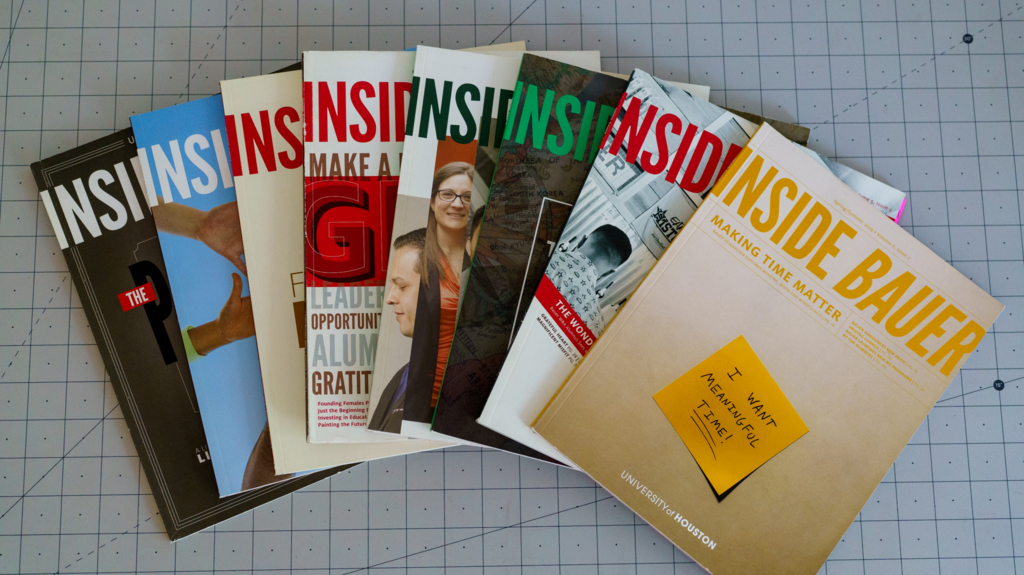
I had the privilege of designing 12 issues of the magazine. Each stunning printed publication held 100+ pages of feature stories and core articles, custom photography and videography, and tailored graphic design, with social media campaigns and an online digital issue to support this multi-channel effort.
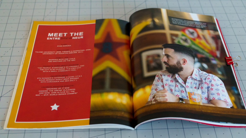
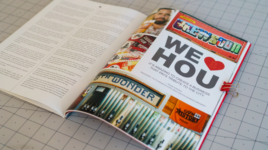
Below is my award-winning spread design for "The Wonderful Kind," a feature story in Volume 5, Issue 2 about a Bauer College alumnus' entrepreneurial success with his brewery, 8th Wonder.

The production of each issue followed a structured formula that allowed our entire team of creatives to move in tandem, keeping a strong pace to meet content requirements and critical deadlines.
Amidst the university's strict brand guidelines and a structured way of producing the magazine, there was still enough space for us to express ourselves creatively.
You can really see my design fingerprints on the feature spreads, which were unrestricted by the university brand guidelines. In all of my feature stories I play with typography, my favorite foundational design component. In the spreads my typographic work dances with the photography in an effort to capture the subject's essence and echo core elements of the story.
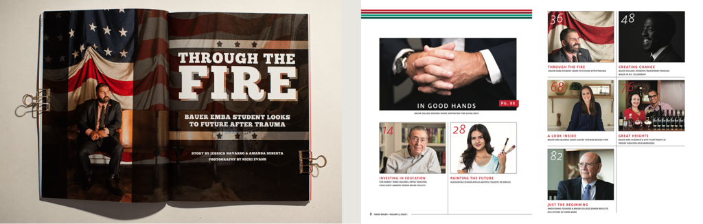
Below is my spread design for "Through the Fire," a feature story in Volume 5, Issue 1 about a chemical engineer who survived a building explosion and persisted through physical recovery and trauma to pursue educational opportunities at Bauer College of Business.

A critical stage of the magazine production lifecycle was prepress and handoff to the print shop. Each issue's digital file was meticulously prepared to meet print production requirements.
Once the issue was printed, copies were sent to all students, faculty, staff, alumni, and community partners of the Bauer College of Business.
The magazine received multiple industry recognitions including:
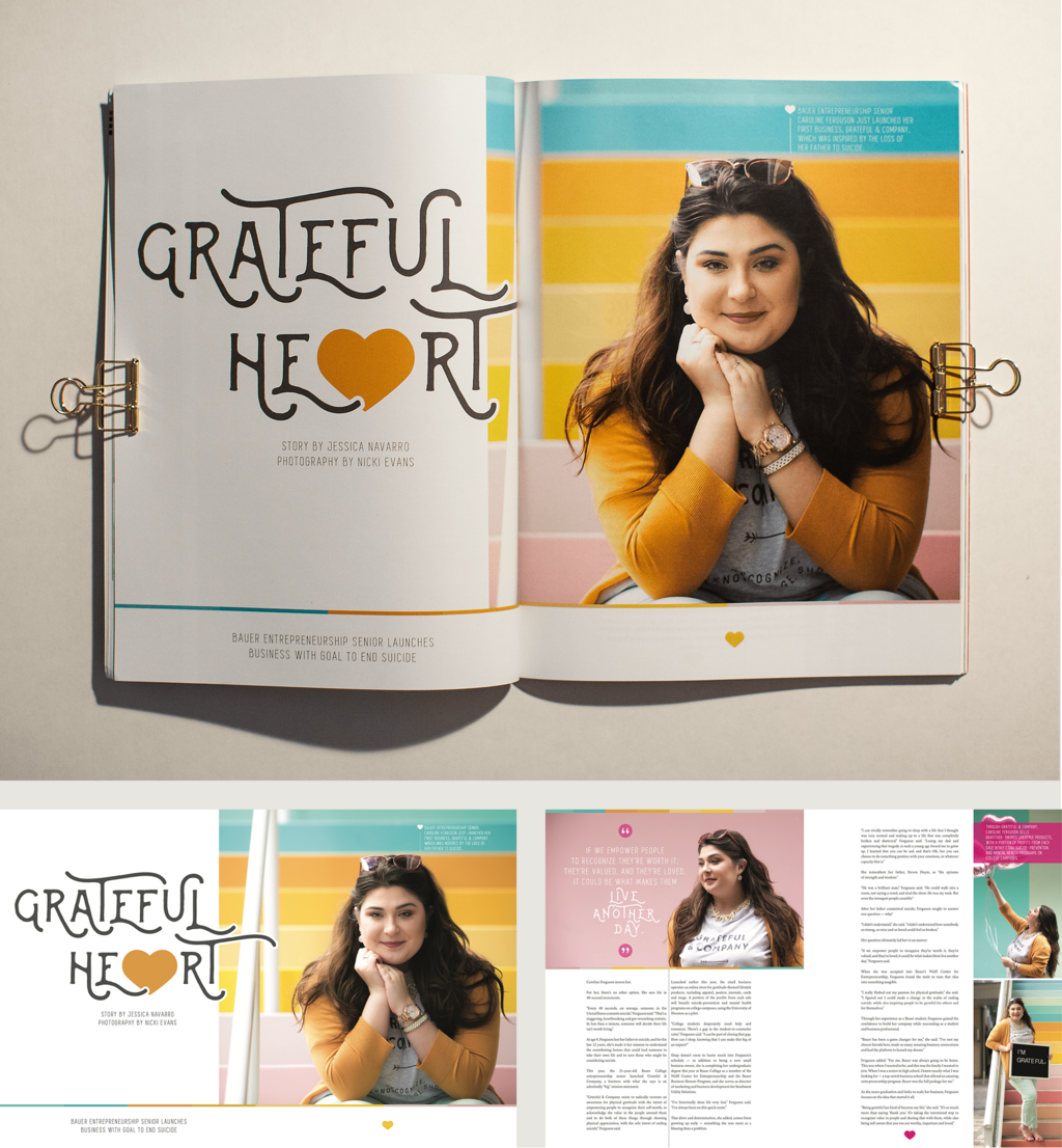
Below is my award-winning spread design for "Grateful Heart," a feature story in Volume 5, Issue 2 about an entrepreneurship senior student whose small business goal is to end suicide.