Libby Library Companion iOS App


Hi, my name is Kae. I have a Master’s degree in UX and a Bachelor’s degree in Graphic Design, and I’m going to take you through my conceptual redesign of the Libby library companion app.
This is a one-shot project: A small-scale conceptual design challenge, focused on an app or website I use regularly, done in a short amount of time to highlight my UX and UI skills.
Context
The Libby app is a library companion app that allows library members to digitally borrow eBooks, audiobooks, and more for free with their library card. I am a frequent user of the Libby app because it’s a great way for me to support my local library without having to travel to the library every time I want to read or listen to a new book.
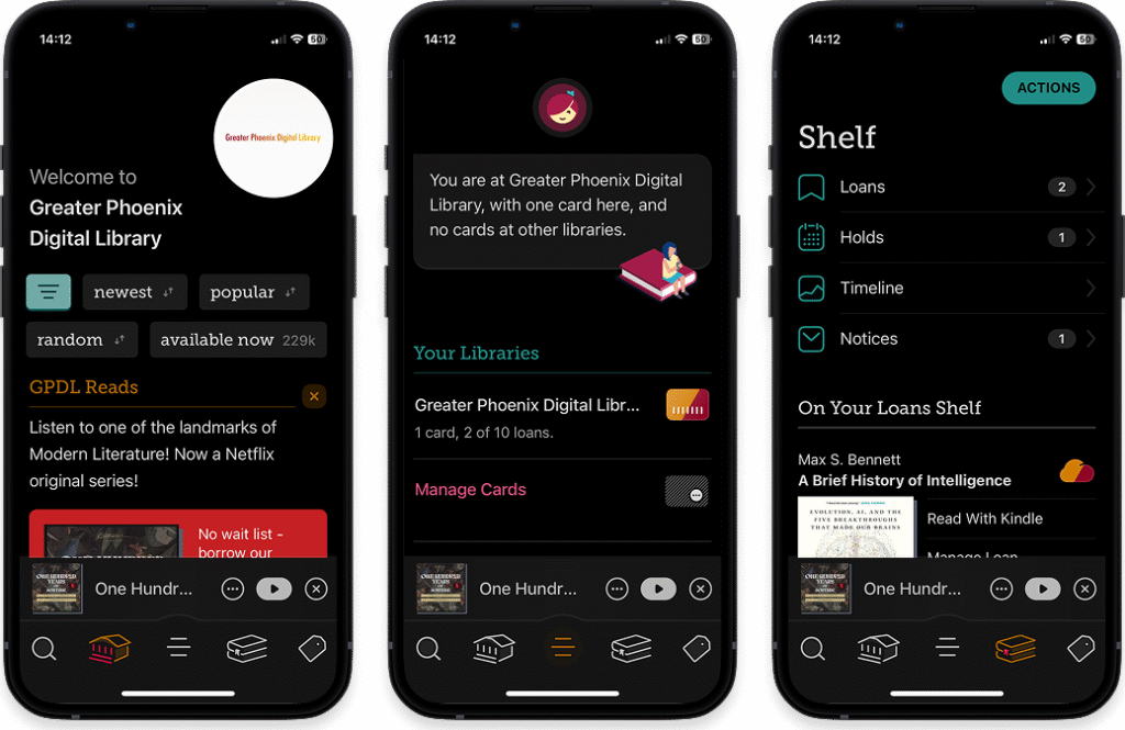
Left-to-right: Library screen, Home screen, Bookshelf screen
Overview
The Libby app is already well designed with a strong color palette and a lot of functionality in the app, so the challenge here is iteration not redesign. I am looking for opportunities to better bring the vibrant and playful brand colors to life in the interface and tidy up the information architecture to create a more intuitive user flow across the app.
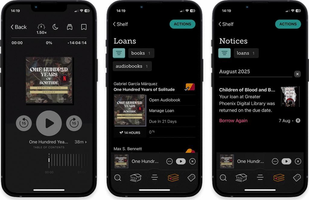
Left-to-right: Audiobook screen, Loans screen, Notices screen
How It Started
First and foremost, as a frequent user of the Libby app, I know I want to create a better home screen to anchor users. In my experience I find that I get lost when I jump around the app to interact with other feature and then I have trouble finding my way back.
Second, I want to take the beautiful Libby brand color palette and infuse it throughout the interface. As a seasoned designer, I truly believe I can make any color palette harmonize in an interface, so I get excited when I encounter colors that others might be hesitant to use. My mission is to make Libby’s outstanding magenta sing throughout the app.
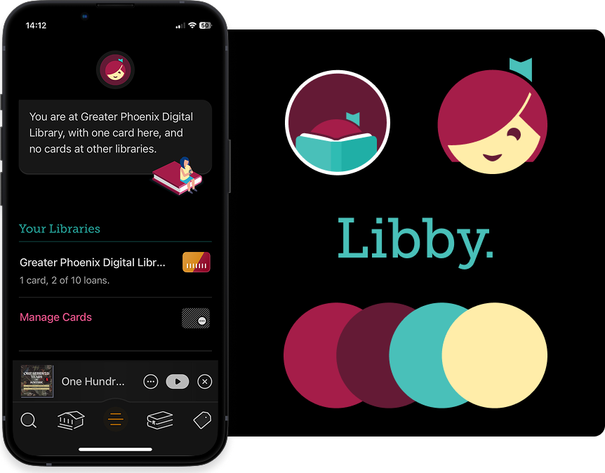
Left-to-right: Home screen, logos, brand colors
The Process
As with a lot of my one-shot projects, I start with the splash page and an initial flow as my warmup. This strategy typically gives me a few low-clutter screens to test out color options, UI design elements, logo and graphics usage, and helps me set the tone for the rest of my design work. Information architecture-wise, I don’t need to change too much about the Libby library selection flow; I just tidy it up a bit and focus on testing out the updated color usage.
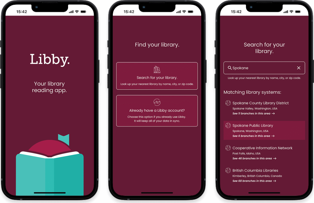
Left-to-right: Splash screen, Choose Path screen, Search and Select Library screen
I go with gently rounded, square UI elements overall and then use fully rounded elements to separate interactive zones of the app. For example, audiobook controls and book actions are pill-shaped to indicate interactivity with a specific book whereas menu, search, and other general app interface elements are squared.
Left-to-right: Menu screen, Audiobook screen, Bookshelf screen
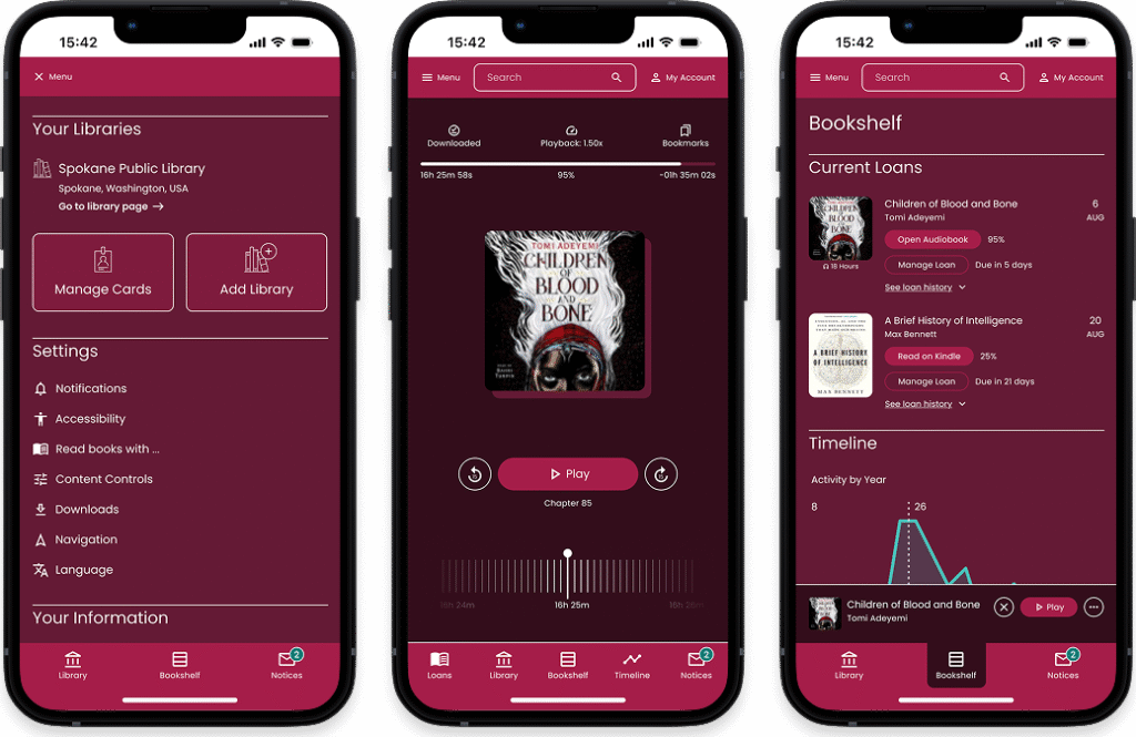
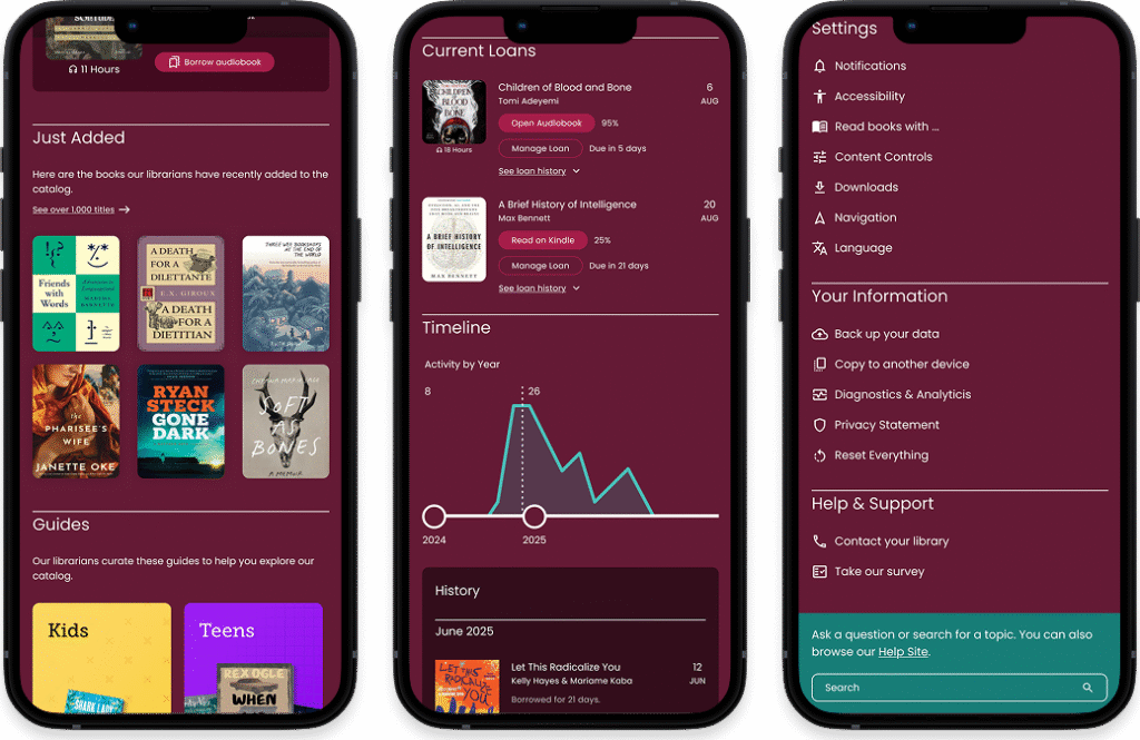
I take a focused look at the information architecture across the menu and bottom navigation and discover a lot of opportunity for consolidation. I add a top navigation with a robust menu, search bar, and account where users can engage with more utility tasks. Then I refine the bottom navigation and make “Bookshelf” into the home screen where users can access their current book loans and view their timeline and history. I also house “Library” and “Notices” in the bottom navigation for quick and easy access. I love how the bottom navigation looks reduced down to three options instead of five—it is much more clean and navigable.
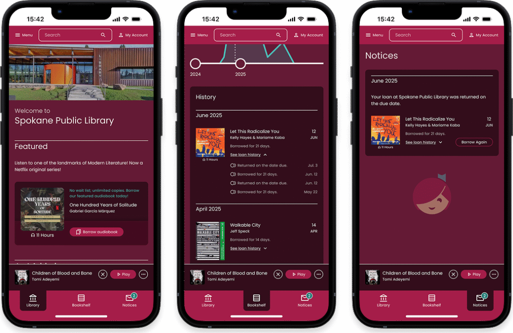
Left-to-right: Library screen, Bookshelf screen, Notices screen
What I Learned
The Libby app is very dense with features and functionality, but it seems like it’s easy for users to miss a lot of it because the information architecture is a bit chaotic and leads to getting lost within the app.
This is not my first library-focused UX/UI work and I have to say, library design is deceptively complex! There are a lot of factors to account for in the book-borrowing process and the vast array of users who engage with library services. Still, I absolutely love a good library project; the complexity and problem solving bring me a lot of joy.
Left-to-right: Library screen, Bookshelf screen, Menu screen
What now?
I may revisit this work in the future and expand upon it, but for now it will remain a one-off.
And that’s the story of this project. Thanks for tuning in!