Mountainside Fitness iOS App


Hi, my name is Kae. I have a Master’s degree in UX and a Bachelor’s degree in Graphic Design, and I’m going to take you through my conceptual redesign of the Libby library companion app.
This is a one-shot project: A small-scale conceptual design challenge, focused on an app or website I use regularly, done in a short amount of time to highlight my UX and UI skills.
Context
The Mountainside Fitness app is a gym companion app that allows members to connect with their local Mountainside location. Gym members can scan their digital card at the check-in desk, book sessions with personal trainers, register for group classes, and track their training sessions. I used to be an infrequent user of the Mountainside app and the biggest pain point for me was accessing the barcode while walking up to the gym.
Overview
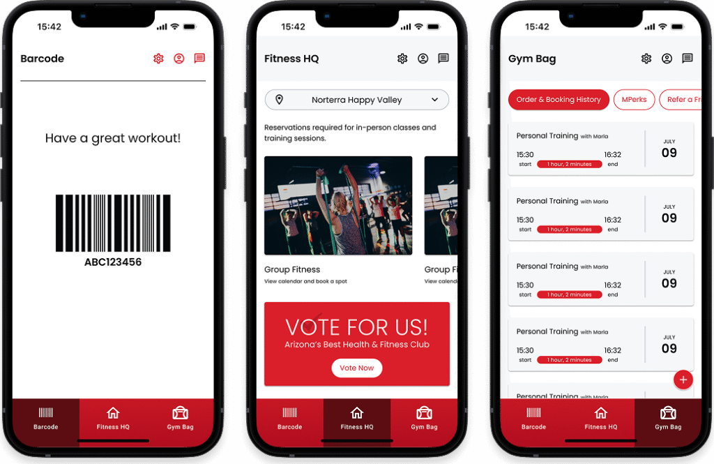
The Mountainside Fitness app leaves a lot to be desired from both design and information architecture. Although the functionality is there, the app is clunky and has an overly utility feel to it. The challenge here is bringing life and modernity to this app while maintaining a simple interface that is easy to navigate on-the-go, such as when walking into the gym or between training sessions. I am looking for opportunities to introduce design elements with Mountainside’s brand colors and organizing the existing functionality into a flow that mimics the natural progression of gym events: booking sessions -> arriving at the gym -> tracking workout.
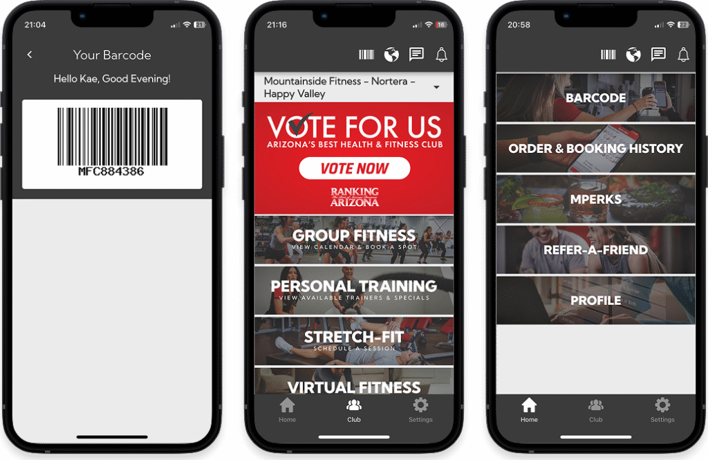
Left-to-right: Barcode screen, Club screen, Home screen
How It Started
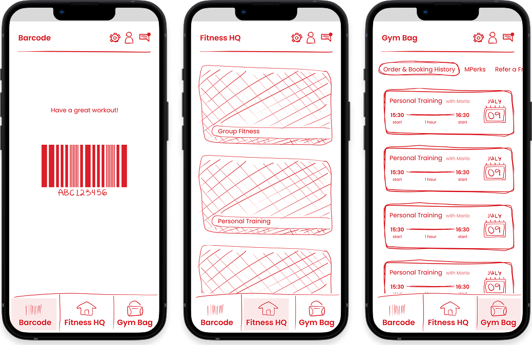
I start with wireframing because I want more freedom to rapidly explore several layouts and options before getting into the visual design.
I want to restructure the way the features show up in the app to achieve a logical progression of gym events and meet users’ immediate needs first. One of my focuses is making the barcode the landing screen when the app is opened, this way users can open the app while walking into the gym and their barcode will be loaded and ready for scanning by the time they make it to the check-in desk.
The Process
I decide to limit the scope of this one-shot project to the three main features and organize them along the bottom navigation: “Barcode” for the digital card, “Fitness HQ” for booking training sessions and classes, and “Gym Bag” for all training session tracking, orders and booking history, and other member related items. I am typically not a fan of cryptic specialty microcopy, but there is an opportunity here to be creative with “Gym Bag” because the context of the app helps make up for the ambiguity of the title. I decide to roll with it and I’m happy with that decision.
I add a utility navigation at the top for Settings, Profile, and Messages because these are secondary features that the user will engage with intermittently and having them out of the way helps reduce clutter.
What I Learned
The Mountainside app has all of the necessary features, but lacks a sensible flow in the context of gym attendance. I put a lot of thought into the stages a member would encounter and how the app could be a better companion along that journey.
What now?
I may revisit this work in the future and expand upon it, but for now it will remain a one-off.
And that’s the story of this project. Thanks for tuning in!